About
Clarity, considered.
IRILUXA began with a plain observation: the products people put in their eyes are designed for shelves, not for the people holding them.
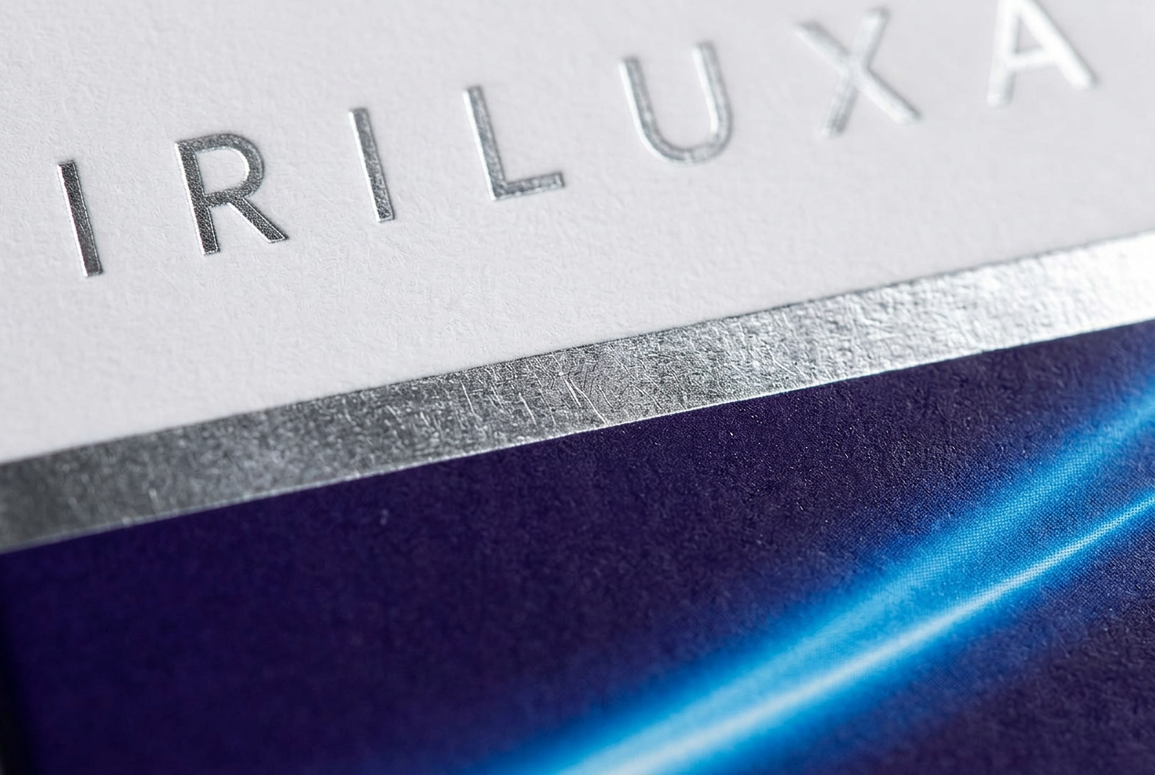
We wanted a redness reliever that behaved like a considered object. Something with a weighted cap, a carton that does not shout, and copy that does not stretch the truth to fill a panel.
So we started at the other end. Manufacturing first, in Miami, Florida, where the solution is prepared, filled as a sterile ophthalmic solution and sealed. Then the carton, the bottle, the typography and the light.
The result is one product. It relieves redness of the eye due to minor eye irritations. That is the whole promise, and it is one we can keep.
The IRILUXA standard
Clarity is not a visual effect. It is the standard.
Every detail should make the product easier to understand, easier to recognize and more considered in everyday use.
Purpose, made clear
The product purpose and essential information should be immediately understandable.
Precision over excess
Every visual and verbal detail should serve a reason, with nothing added simply to attract attention.
Designed with restraint
A refined object created to feel considered in the home, on the counter and in a daily routine.
Trust, earned carefully
Product, manufacturing and performance information is published only when it can be properly supported.
See the thinking behind the formula.
Explore the science