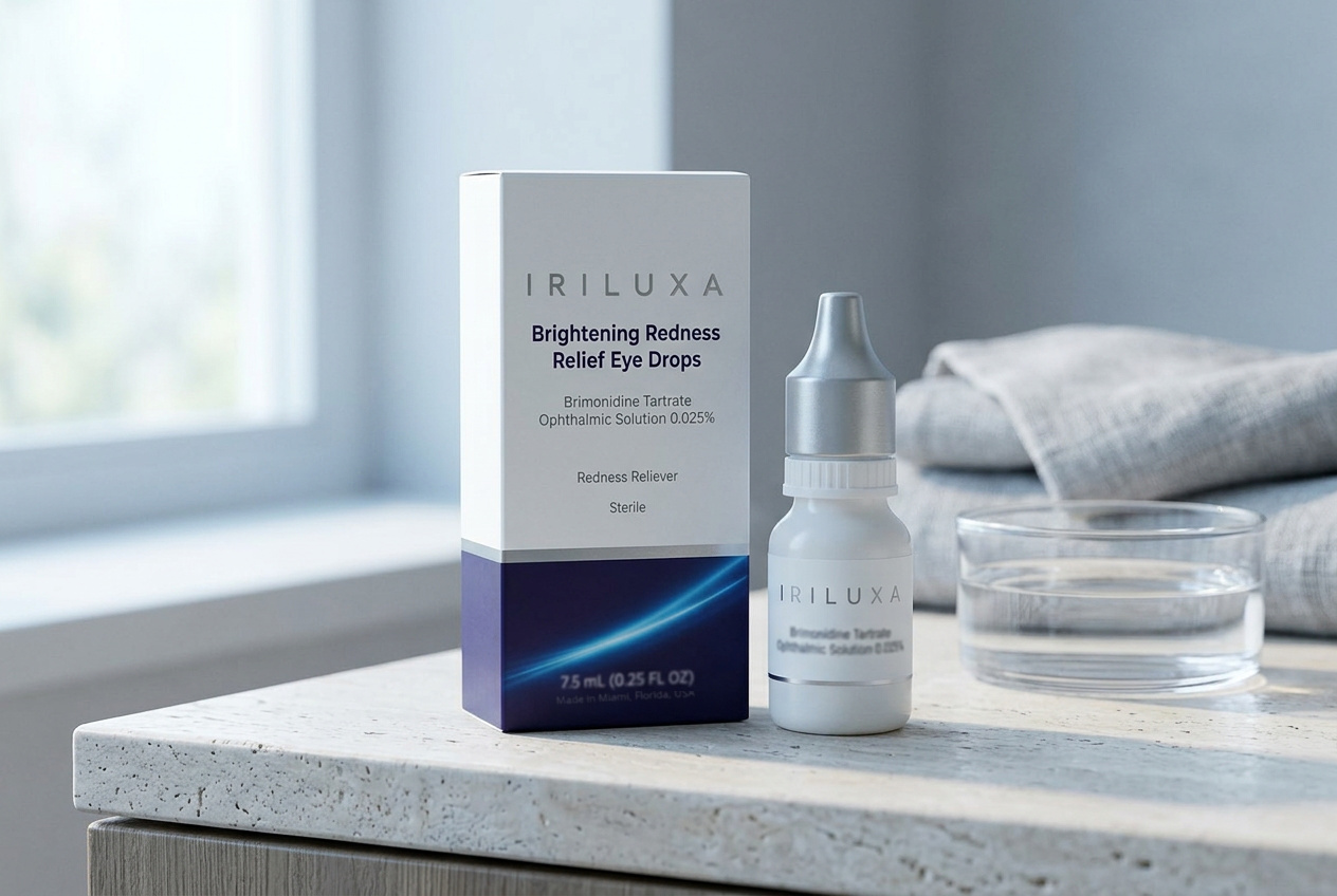
Most eye drops are designed to be found on a shelf under fluorescent light, so they shout. We designed for a different moment: a bathroom counter at seven in the morning, where nothing needs to shout.
The carton is uncoated stock with a foil wordmark, split by a single deep violet field and one line of light. Everything required by the label is present and legible. Nothing else was invited.
The bottle
The bottle is soft matte with a weighted silver cap, sized to sit in a palm rather than in a drawer. It reads as an object you keep out, which is also the practical outcome, since a drop you can find is a drop you use correctly.